OVERVIEW
The logo of Simo&Ale Creations was characterized by subpar quality and a lack of coherence in its colour scheme. The overall design fell short of meeting the expected standards, as the visual elements appeared to be of low resolution or poorly executed. Additionally, the chosen colours lacked harmony and failed to complement each other effectively. The absence of a cohesive colour palette resulted in a jarring visual experience, which undermined the logo's ability to convey a strong and unified brand identity.

SKETCHES
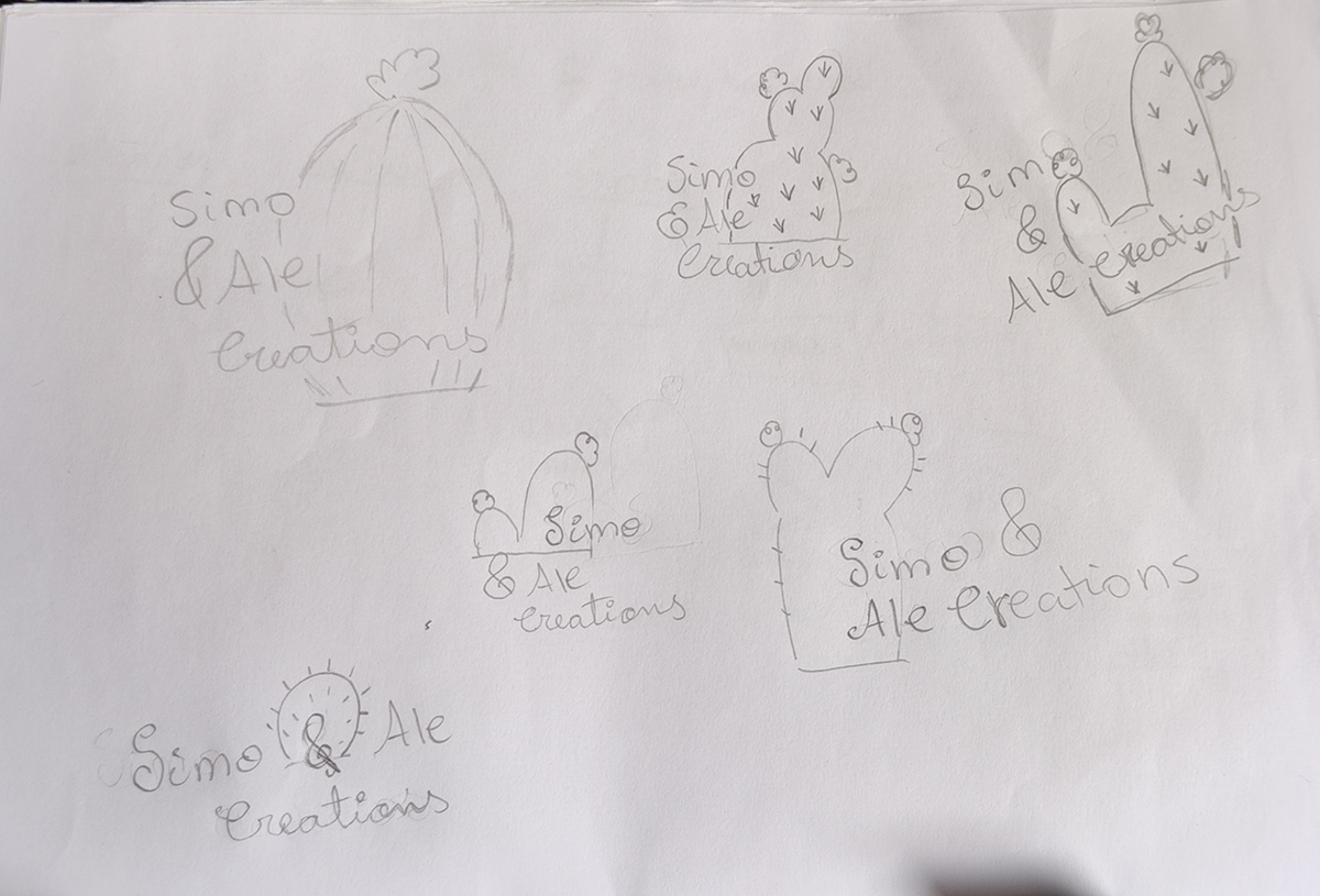
Given the brand's significant usage of cacti in its products, incorporating this iconic element became a necessity for the design. Understanding the importance of capturing the essence and identity of the brand, I deliberately chose to utilize cacti as a central theme in my design process. Recognizing its symbolic significance and visual appeal, I wanted to ensure that the final design paid homage to this integral aspect of the brand's offerings. By embracing the cactus motif, I aimed to create a design that authentically represented the brand's core values and resonated with their target audience

COLOUR PALETTE
I curated a colour palette of green, pink, black, and white to capture the brand's essence. Green represents the cacti's natural hues, symbolizing growth and harmony. Pink adds femininity and playfulness, complementing the focus on women's accessories. Black and white bring contrasting balance and sophistication, lending a timeless elegance. This carefully chosen combination aligns with the brand's image, creating a visually appealing experience.

OPTIONS
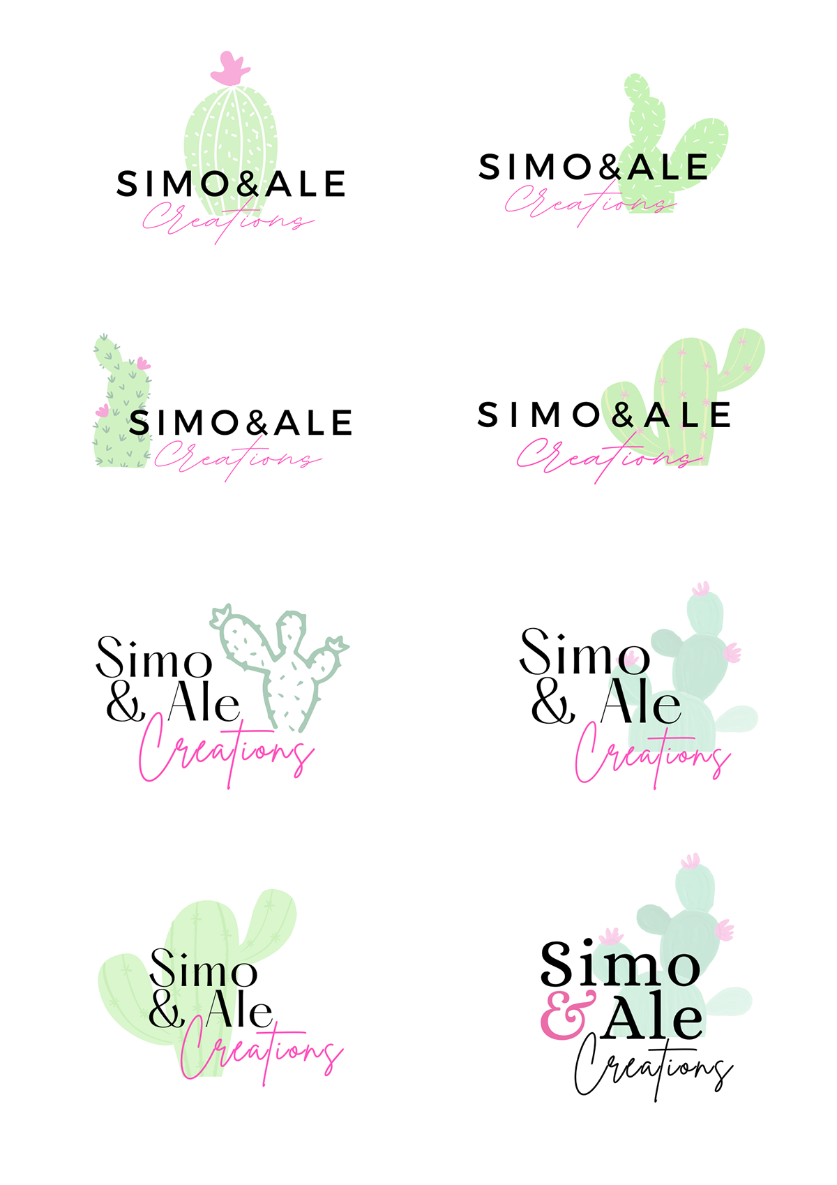
To explore various possibilities and ensure a comprehensive design approach, I developed four similar yet distinct design options. Each design aimed to encapsulate the essence of the brand while incorporating the prominent use of cacti. Through these iterations, I sought to strike a balance between cohesion and differentiation, allowing for subtle variations in style, composition, and visual elements. This approach enabled me to present a range of design choices, each with its own unique character and visual impact. By offering multiple options, I aimed to provide the client with a comprehensive view of the design possibilities, empowering them to make an informed decision based on their specific preferences and brand identity.

FINAL DESIGN
The final design of Simo&Ale Creations successfully catered to the preferences of the target audience, embracing a youthful and vibrant aesthetic. The use of bright and playful colours created an engaging and dynamic visual experience, capturing the attention of the intended demographic. The design exuded a sense of energy and creativity, resonating with the brand's youthful and spirited identity. Overall, the final design effectively met the expectations and preferences of the target audience, aligning with their tastes and successfully representing Simo&Ale Creations' brand image.

APPLICATIONS


